
Design and build of an online store with a custom theme
OVER Cosmetics – natural cosmetics, own brand and private label
over-cosmetics.pl is the store of a natural cosmetics manufacturer, where one address holds seven product lines, two entirely different audiences and a second, parallel B2B offer. In design terms this is not one store — it is three stores in one, and the whole job was making sure the customer never feels that.
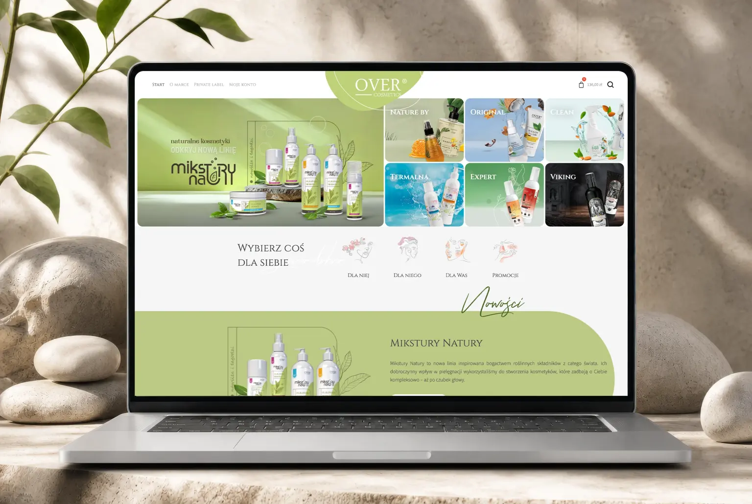
We built a custom WooCommerce theme in which the look of the store shifts depending on who the customer is shopping for, and where the homepage can be rearranged without a developer. Underneath, the store connects to Enova, the client’s own CMS and their support centre, while a separate module handles consultant sales on their own price list.
Stage 1
Information
architecture
-

UX scenarios and purchase paths
-

Wireframing and category tree
-

Design documentation
Two taxonomies that cross each other
The range can be organised in two equally sensible ways, and customers genuinely use both. Some search by audience — for her, for him, for you both — then narrow down to body, face or beard. Others already know the product line: Mikstury Natury, Nature by OVER, OVER Original, OVER Clean, Linia Termalna, EXPERT or Viking.
A conventional store picks one of those axes and buries the other in filters. Here both had to carry equal weight, and the category tree runs four levels deep and duplicates itself across audiences — the same balms and gels exist separately in the women’s and men’s branches, because in each they mean something different.
The answer was a sidebar with an expandable tree on the listings, breadcrumbs showing which branch you are in, and a “pick something for yourself” selector on the homepage as the way into the audience axis. The customer enters along one axis and can switch to the other at any point, without going back to the start.
Stage 2
Design
-

Theme that shifts by audience
-

Custom theme and a full set of screens
-

Design system and block library
A store that changes mood with its audience
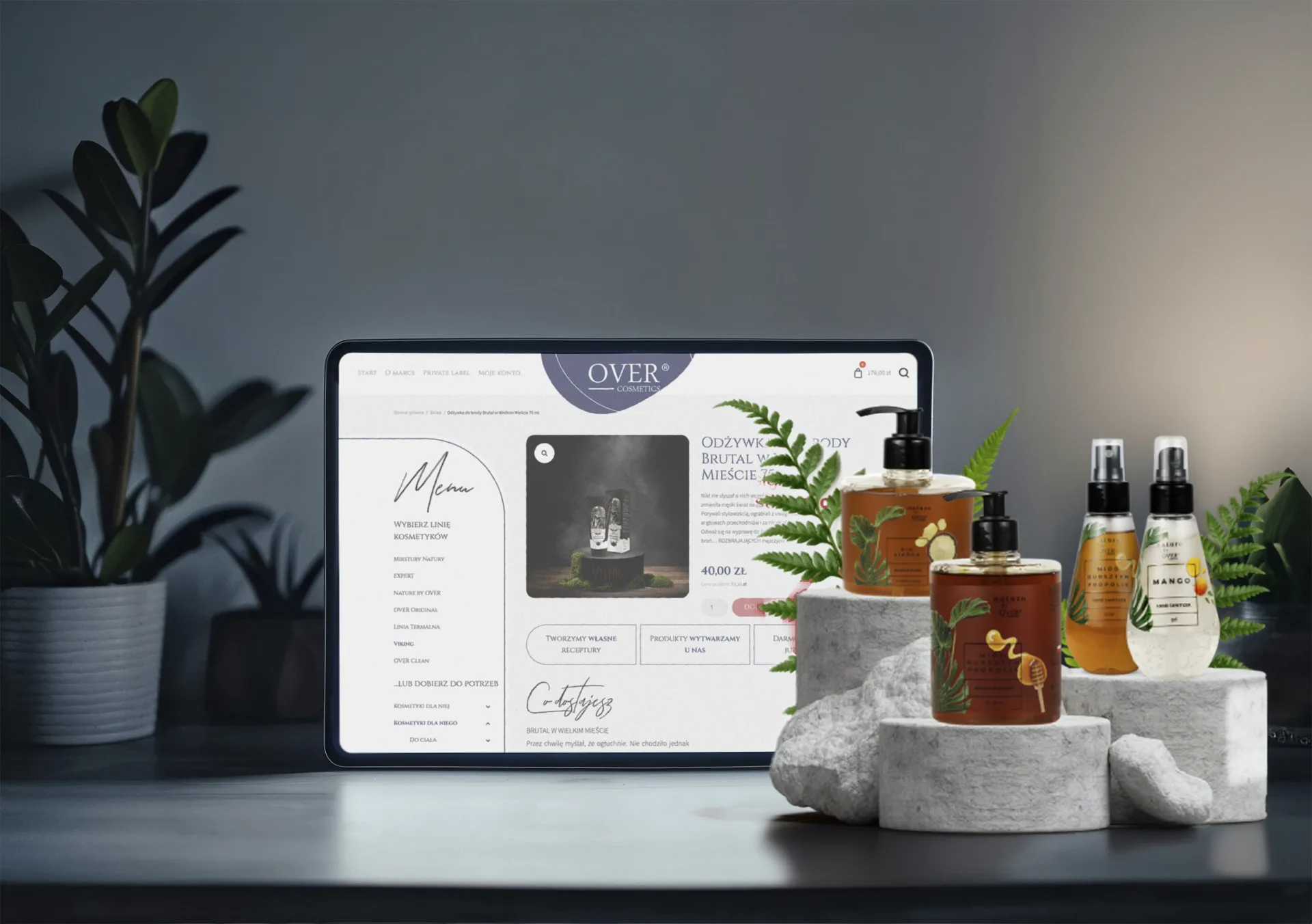
The strongest element of the project: entering an audience section repaints the entire template. The women’s side works on a rose palette with a delicate line-drawn botanical motif. The men’s side switches to navy, a heavier typeface and darker photography — furthest of all goes the Viking beard care line, which gets its own noticeably moodier treatment.
This is not a cosmetic change of colour. The palette shifts, so does the accent typography, the photographic style and the ornament — the same store sells to two people who do not want to look at the same thing. To stop it falling apart into two unrelated sites, everything sits on one design system: the grid, the type scale and the product page and cart components are shared, and only the mood layers vary.
Identity: elegant without looking clinical
Natural cosmetics are easy to design so that they end up looking either like a pharmacy or like a craft fair. The visual layer balances between the two: a serif face set in capitals for headings lends gravity and a nod to premium cosmetics, while a handwritten script accent takes the stiffness back out of it.
Holding it together is a system of soft, organic shapes — rounded forms frame the mark in the header and separate sections in place of straight rules. Product photography is staged on natural plinths: slices of wood, stone, fruit, leaves. Together it reads as a brand that makes cosmetics out of something, rather than one that merely says so.
A product page in a category where the ingredients decide
In cosmetics the customer compares volume, ingredients and purpose, often across brands. The product page shows a gallery with zoom, the price alongside the unit price per kilogram — because that is what makes different pack sizes honestly comparable — a short sales hook, the quantity selector and the buy button all within one glance.
Below it comes a long description: ingredients, what it is for, how to use it. That volume of text is deliberate — this category sells on knowledge, not on a slogan. Under it runs a trust strip (own formulations, manufactured in-house, free delivery over 100 PLN) and a row of related products.
The same thread continues in the ingredient encyclopedia on the homepage and in the section introducing the chemical technologist behind the formulations — a face and a credential instead of an anonymous manufacturer.
A homepage the client maintains alone
The homepage looks elaborate, and it is — but only from the outside. Internally it is a set of Gutenberg blocks with ACF fields: a line banner, a grid of brand tiles, the audience selector, a carousel with quick add to cart, the ingredient encyclopedia block and customer reviews. Each with its own settings and a fixed set of variants.
That was a design decision, not a technical one. A design the client cannot change themselves ages at the speed of one campaign. With seven lines and seasonal launches the display changes several times a year — marketing rearranges the blocks on their own, and the design system makes sure typography, grid and spacing stay consistent whatever the order.
Stage 3
Implementation
and integrations
-

Data exchange integrator
-

Consultant module
-

EU regulatory compliance
The integrator: store, CMS, Enova and support centre in one loop
The store is not an island. An integrator keeps data flowing between WooCommerce, the client’s internal CMS, Enova and the support centre — stock levels, prices, product data and orders all circulate in one loop, with nothing retyped by hand.
For a manufacturer that both makes and ships, this is what makes a same-day dispatch promise workable: the support team sees an order at the same moment the warehouse does, and the availability shown on the site is real.
The consultant account and five discount tiers
A separate module allows registration as a consultant. That account gets its own price list, its own payment and delivery methods, and above all a discount that rises across five tiers — the higher the basket value, the lower the unit prices.
The hardest part in design terms was surfacing the tier without turning the cart into a spreadsheet. The consultant can see at any moment which tier they are on and how much is missing to the next — information that raises order value on its own, because it closes the decision rather than complicating it.
Alongside it runs a second B2B path: a private label page offering contract manufacturing for salons, spas, hotels and retail chains. So the store handles retail, consultants and contract enquiries without splitting into three separate sites.
Security and regulatory compliance
The store is maintained in line with current EU requirements for online sales — from how prices and price reductions are presented, through consent and personal data, to the information duties in the cart and at checkout. The unit price on the product page belongs to the same group: a formal requirement that happens to make buying easier.
In summary
over-cosmetics.pl is a store where the designer’s work does not end at appearance. The most value came from designing a system rather than a page: an information architecture that carries two crossing taxonomies, a theme that changes mood with its audience, and a block library that marketing assembles on its own.
Technically the store runs on WooCommerce with a custom theme, Gutenberg blocks with ACF and an integrator tying it to Enova, the client’s CMS and their support centre. It handles retail sales, consultant sales and private label enquiries. It is an example of a project in which UX/UI design, the build and the integrations all came from one team.